PROJECT: Flex-Oh
DATE: 2020
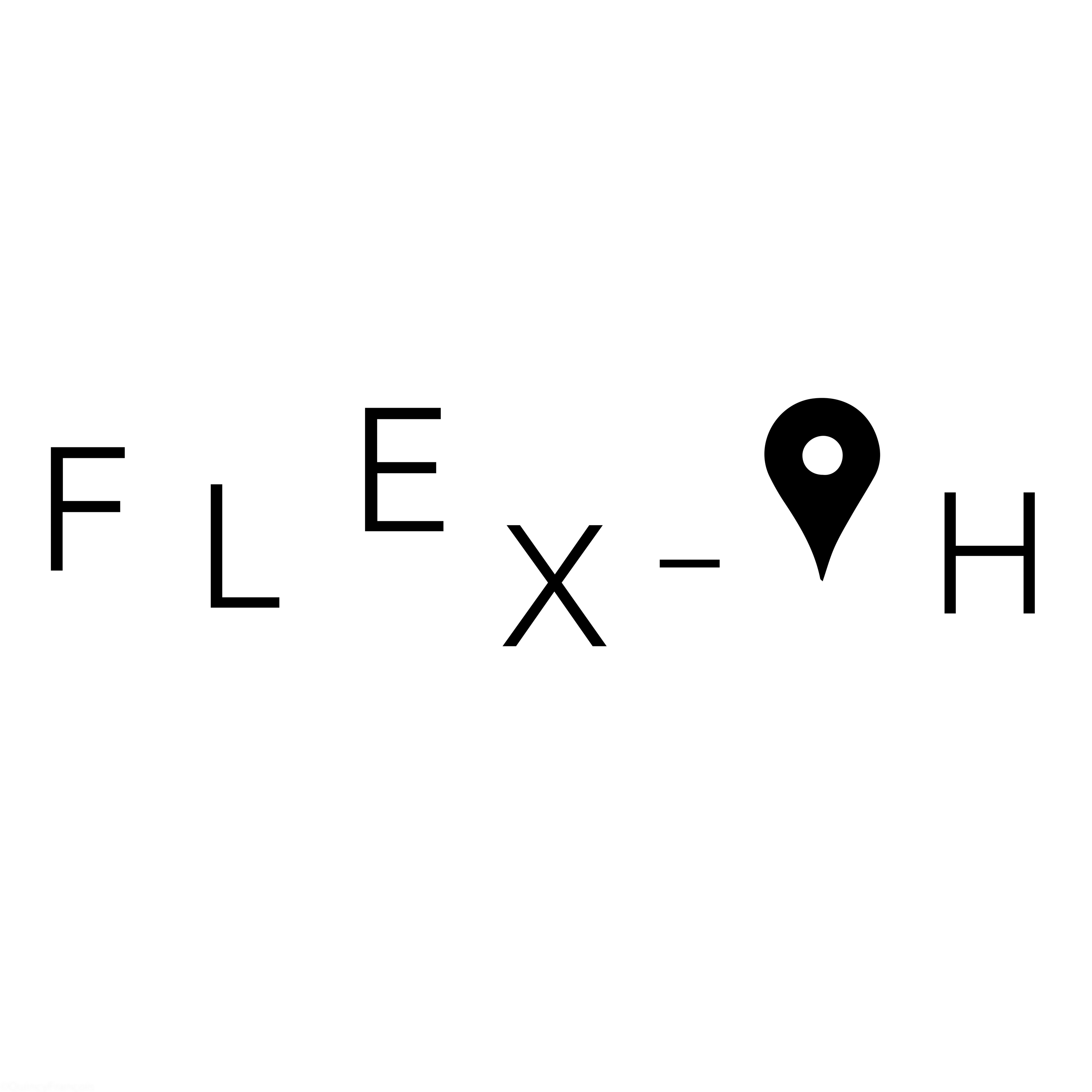
LOGO DESIGN
This logo symbolises a nomadic experience where the letters function as signposts, just like on a map. The letters can change position just like in a nomadic existence. Nothing is fixed and everything is open to change. The ‘o’ has been changed here into a ‘marker pin’ that clarifies the ‘map-event’ even more.
Flex-Oh is a company that wants to bring the nomadic lifestyle to their customers. This in different formulas such as eating, sleeping,...